
I also was informed around this time that the exact material which I'd specified before would weather and eventually rust despite the fact that it's supposed to be coated not to. The whole rusting thing is awesome, but I don't want to worry about dripping rust on my neighbors properties and on mine or having to replace it if it rusts too much.
Soooo, after some research I think I'm going to be using McElroy Metals. As of right now I'm trying to decide between these two colors:
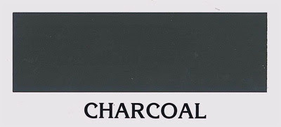

(Please note, the blue color's a bit hard to reproduce, on the computer; even the scan of the color chart that I made is off a bit)
I like the blue cause it's bold, but not overly so... though the charcoal has a cool ominuous feel to it, which I like as well. To try and get a feel for what color to use as well as what rib-pattern to use for the corrugated siding I did some photoshopping of this picture:


I think I've decided to go with a corrugation pattern that repeats every 12" as opposed to a smaller corrugation that repeats every 3". I think the larger pattern gives it more of a "large commercial building" feel as opposed to an industrial feel. My mom was concerned that only having a small number (20) of ribbed patterns going down the front would be wierd because of the way the lines would intersect with the window and door openings. I photoshopped both the small and large patterns over the front elevation plan and found that I'm happy with just a few ribs.


Well, if you're still reading at this point, then hopefully you have an opinion on which of the various things I've laid out look best. Any thoughts? Leave em in the comments if you do.

1 comment:
that blue is a little crap. how about some sort of grayish green?
Post a Comment